
Evidence Of Work
- Nov 12, 2015
- 10 min read
I wanted to do a post to evidence all my work for this project in a clear and concise format, as although I've tried to keep my previous blog posts as clear as possible, my work has jumped back and forth between weeks which might make things a bit more confusing. My previous blog posts will however include any extra work I did for the project that aren't in the outcome, but were things like playing in engine to work things out etc. Also some of the images are of my final models, and don't show the previous versions which can be found in other posts. To see the full iterative process please look at my previous blogs and the evaluation.
First, the evaluation:
Cite a range of personal film scenes (x3) and images/screen captures. What are
the reasons for choosing these scenes? What are the main elements that stand out in the
choice? Why would they make a good scene for building?
Overall my choices for the project boiled down to three main rooms; the community study room, charmed manor (the attic or the lounge) and the room of a thousand fists from Kill Bill. I chose each room based off the following list of criteria: strong lighting, is populated but not too cluttered, has a mix of complex and simple objects, a range of different materials, potential for movement (for the stretch goal), modular assets, lots of reference and most importantly, doable in the time constraints.

I chose Kill Bill for its strong lighting and interesting design that was mostly made up of modular assets. However I scrapped it because of its scale and surroundings. Cutting off the restaurant around the room would be tricky, and ultimately it was too ambitious.


I chose the Charmed Manor for its charming objects and atmospheric lighting. The attic room especially tells a good story. However the attic was full of far too many complex objects to be completed to a high quality within 5 weeks, and the living room was too open plan.

Finally I chose the Community study room because it has lots of reference, enough assets to challenge but not overwhelm, there's movement and storytelling potential with the billboard and it has interesting lighting with the blinds, and the lights along the side. The room also has a pleasing colour scheme and a mix of modular and complex assets to make, along with a range of materials to practice PBR with. Overall though, the main elements that stood out to me about this room was its story potential and mix of assets. However I do understand that its appeal is lessened if you aren't a fan of the show.
Individually you will analyse your response to the chosen still.

Our final still was the apartment from the TV show Daredevil. I didn't want to do this room initially, but the majority did. I didn't find it visually engaging, and it's ambitious, which became clear whilst planning it. It isn't a single room, but multiple rooms laid out open plan. The room does have striking lighting and a grungy feel to it which makes up for its lack of assets and mundane furnishings. There's also potential for story in regards to sound and dynamic lighting. Plus it has lots of reference, however this is negated by the fact most of the reference is poor quality, and the room is rarely shown in its entirety. To work out it's lay out, I used a master board of reference to make a bird’s eye view, which was cleaned up by someone else to give us a final plan.

The stills were narrowed down to 3, by choosing shots that show the most areas of the apartment. We then analysed the lighting of the stills by posturizing them in black and white. I opted for either the top or middle still as they had the most interesting lighting. I like the final still as I think it has strong lighting and shows off the apartments main components clearly. I would have liked to have done a still with more character to it, however other stills such as this one: would have made lighting much trickier.
Prop creation methodology, UV layout and Texture creation.


To create my couch and armchair I used reference boards and rough concepts to analyse how to make them. I initially made my cushions too high poly

but realised I could fake a lot of information with normals. The best way to do this for creases was to sculpt and bake down in X-normal. My work flow for each model was quite similar; model, unwrap, sculpt, bake, check normals in marmoset, do final checks throughout. I tried to ask for critique where I could at each stage before moving on. I used my max white box to check scale as I worked.

If my models silhouette changed in Z-brush I would use my lowest subdivision instead, and if that changed I'd use Z-re-mesh.
Lowest subdivision:

Re-mesh:

Whilst making the armchair and couch I realised I could make some parts separate to save on tri's. However I had to remodel the arm of my armchair as one object to avoid a seam.
Before:

After:

My models were changed constantly throughout this project, for example tilting my armchair, re-meshing my blanket, deleting hidden faces and cleaning up topology. Overall I think it's the best work flow I've had so far, as it allowed for iteration, quick quality checks, and accurate models. However to improve it I could have saved myself time by keeping my files neater and backed up, so that accidental changes to models weren't irreversible, such as moving the pivot point of my low poly armchair in max for baking in x-normal.
I unwrapped my low poly models as I went along, as they needed to be unwrapped to bake. However I should have initially unwrapped my couch as a whole, and my armchair needed to be re-unwrapped various times to fix seams.


Although, re-unwrapping my armchair made my workflow increasingly faster. I also had to change some of my UV Layouts to make texturing easier, whether that was the islands size, or position.
For creating my textures I either mashed up textures from textures.com to create an albedo that I then generated all my other maps from, or I used my own photos.
e.g. textures.com:

Own photo:

I then used various tools in Photoshop to achieve the look I wanted. I updated textures in engine to ensure they looked right. I had some issues with normals in engine, but it just required me to either flip the green channel, or make the surface detail layer on my normal map its own normal map and then overlay it. I used bitmap to do any metal I had, as it created better bases for metalness from my albedo than I could. Overall I think these are the best textures I've produced so far and so I think my process worked well, the most effective part being creating my normal maps as I modelled. However next time I'd think more about how my unwraps will affect my texturing to save time.
Implementation of prop into UE4 Analysis of team work.
There are a lot of issues to talk about here. However I'd say the main ones would be poor organisation, poor communication and poor planning. All three things that you really need to do well to have a group project run smoothly. This project hasn't felt like a group project for me as I've felt like I've had to take on the brunt of the work. I definitely think we should have planned more thoroughly from the beginning by using a Gant chart and having more internal deadlines. I should also have pushed to have people work in the same space. I realise now that I should have updated the white box more regularly for people to work from. Although the only things that changed scale were my assets, and the walls.
Due to an issue with another member getting props into UE4, I took over the task and laid out both a checklist for models and where they needed to be uploaded. I also gave people a time to get them up by. However this didn't work that well because people still gave me models with errors, put them in the wrong place, or simply didn't upload until quite late in the project. I ended up taking over some people’s assets to fix them as a result. Eventually I got all the props in, but it would have run more smoothly had people given me tidy assets and stuck to deadlines. I think more informal team meetings would have been beneficial, so that anyone who was struggling would have had more opportunity to speak up earlier on. I also think we should have kept track of the asset list more, as we missed out some assets when planning, and it would have highlighted any problems with progress earlier on.
Reflection on your project performance and developing action points for improvement.
I'm not usually good at keeping to deadlines, staying organised, or being skilled enough to work fast but well, and whilst my work could be improved, I think for the amount I've done for this project, my outcomes have been of a reasonable standard. As well as modelling some of the main assets in the still I've; planned the asset list and timetable, helped with the birds’ eye of the room, made the white-box to scale in max, put it and everyone's assets into engine, sorted out positioning and scale, and either fixed some models, or taken over a model entirely. I've also lit the entire room, done the still-match up, made the matinee, did the post-processing, made all the materials and the floor and ceiling.
I know I could have worked more efficiently as I went along, for example keeping my file structures neater, taking progress shots as I go, and making sure I updated the white-box for people each time it changed. I would also have kept closer track of the project progress, planned my own work more thoroughly, and taken more time for my individual work, I neglected it a bit in order to get the room together. Next time I'd spend more time polishing my own assets. I'd also make sure I'd saved before making any major changes in engine, as that slowed me down quite a bit at times. However in regards to keeping other people on track, there's only so much I could have done, so in general I think I handled it quite well. This project is also the first one in which I've felt like I truly iterated on my models and made them better by going back and forth between the different stages. Especially with my armchair which is the best example of where I've done this.
Evaluation of Final Image Submission. Suggestions for improvements.
Still next to original.

Our Beauty shot doesn't match the original still as much as I would like it too, however I feel that with the time constraints I had to do the match up, as I was busy doing everything else in engine as well, and the amount of time I actually had to edit textures, models and colours in preparation for the final hand in, it isn't as far off as it could have been. The main issues with it are; the lighting is still a bit too dark and some of the shadows are a bit off, the colours are slightly off, the beams should have been made differently (they are actually metal structures attached to parts of the ceiling that drop down), there are missing assets in the scene, the walls are not the right kind of bricks, the window textures are wrong, the main rug is clearly inaccurate, the positioning and size of the walls is wrong, and the size of some of the assets doesn't match those In the still. Although I think that was more of an issue with perspective warping and differences in real world size to game size assets, than with the room itself. Essentially my suggestions for improvement would be to address all the issues mentioned above.
Team Manifesto:
The Team will put together a justification for choosing the still to recreate.
Our final still was the apartment from the TV show Daredevil. We chose this room because we felt like it had striking lighting and a rugged feel to it that would make for an engaging and spacious room to move through. It had enough assets to keep us busy for 5 weeks, whilst still being manageable to make. The amount of reference available for the room also meant that we could re-create it as accurately as possible, without having to fill in too many blanks. We chose this still specifically because out of the 3 we narrowed down to (that showed the clearest shots of the apartment) it had the boldest lighting, showed off the most interesting parts of the apartment clearly, and was composed in a way that we felt was engaging, yet wouldn't be too hard to re-create. In essence we wanted to choose a still that was not only a true representation of the apartment, but also of the show, as this still contains extra assets such as the pillow and blanket on the couch, that tell some of the characters story, as well as being assets in the shot.
A description of the team and individual planning and development work.
The teams roles haven’t been as evenly divided as they could have been, due to various extenuating circumstances, certain people have had to take on more work on others. There has definitely been an imbalance of roles within the group, mostly caused by either a difference in expertise for certain roles, or mistakes made when distributing assets for people to work on. Individual planning has confused the work flow in places, however once tasks were clarified via social media most of the issues were fixable.
Development mostly went through one person, with them receiving the work, feeding back to others and updating it. There could have been more development of individuals pieces of work had we found a successful method of sharing our work from the beginning of the project. In addition, if the initial planning for our team had been nailed down from the beginning, the project would have gone more smoothly, and had we had more regular team meetings we could have found and fixed certain issues before they became a problem. There should have been more internal deadlines for people to meet, so that we could have ensured people stayed on task more successfully, not doing so has meant that what should have been a polish week, has become a week for finishing off the actual work.
Essentially confusion with tasks, lack of communication, and people’s individual methods of housekeeping and distributing their work clashing, were the main issues our group faced with this project.
So here is a clearer illustration of the work I've done for this project. First, the planning I did for the project:
The timetable:
Week1: Chosen a still, created an asset List and assigned tasks, white box completed, stretch: have started modelling minor assets and get some practice with engine
Week 2: Modelling has started, aim to get majority of models completed and minor assets unwrapped
Week 3: unwraps and texturing has begun, some models can be finalised, but only stretch assets should be left.
Week 4: Engine and lighting should have begun, continue texturing.
Week 5: should preferably be done by now and have started polishing/dealing with problems.
The Asset Lists:


The Moodboard:

The BirdsEyeView of the room:

The Analysis of the rooms composition:

The whitebox I made in Max:
The whitebox as it progressed in Engine:


Still matchups:


Concepts and reference for the couch and armchair:
The Final Models:


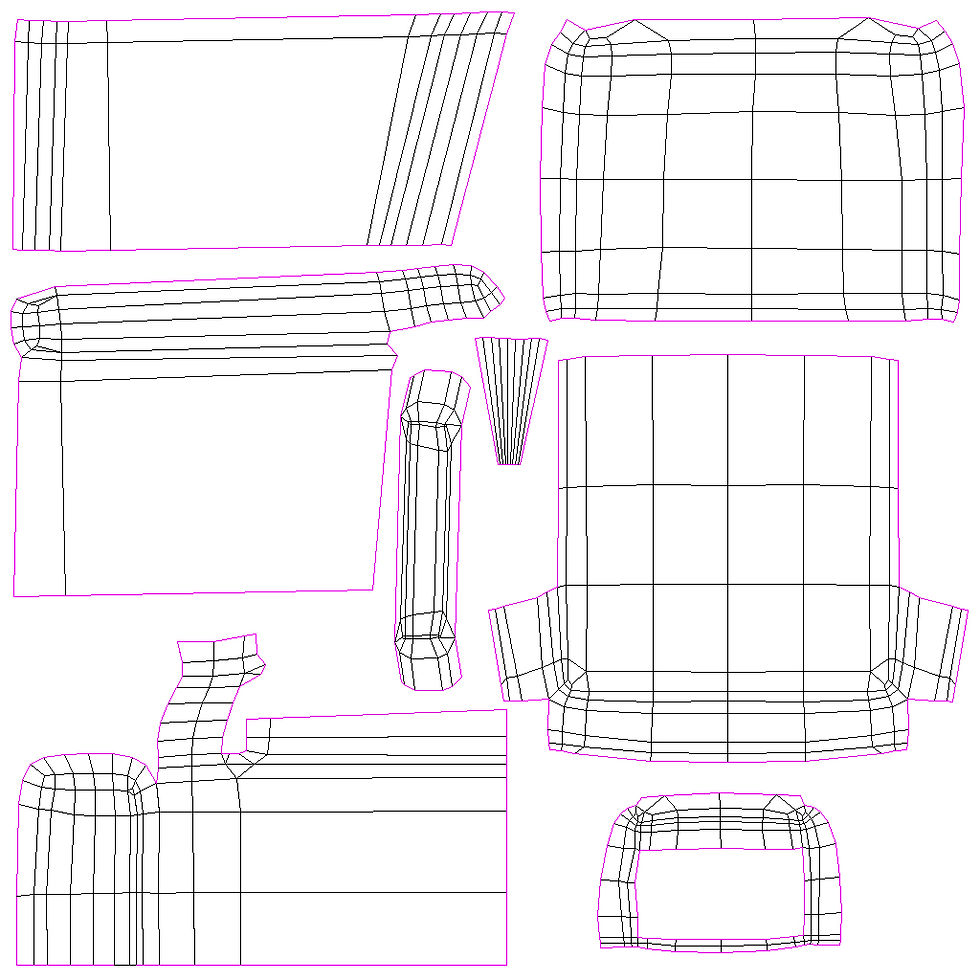
The final unwraps:


The sculpts:


Normals In marmoset:


The textures:

Armchair

Couch

Cushion

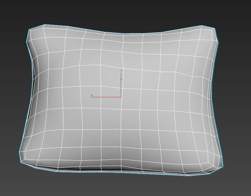
Pillow

Blanket

The final models in engine:


Extra work(missing some last minute materials I made):

PBR Spheres (not related to project, but work done during it.

Fixing an unwrap (I also fixed the walls, floor, ceiling, salt and pepper pots and slider door).

Lighting(Main stages):


Screenshot of final lighting from all areas:


Colour shots of the room:


The beauty shot next to the still:
The animation(slider door):

FOR MORE EXTRA WORK SEE WEEK 6 'CRYING'


Comments